THE PROJECT

The goal of this project was to redesign an existing product and improve its usability. The product our group was assigned was the Tanita BC-545N, a body composition monitor. This device measures not only body weight, but also water weight, muscle mas, fat percentage and many more. The current interface of the body composition monitor was very complex and confusing, and could be improved on many different levels. This project was done with six people from the same master; Design for Interaction. This meant everyone contributed equally to user testing and designing. I did, however, focus mostly on conducting the second user test and the designing of the interface of the redesigns.
THE PRODUCT
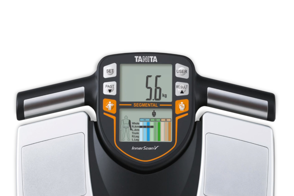
The original product

The redesign
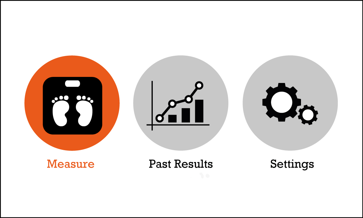
The TANITA BC 545N body composition monitor is more than a scale. It measures fat percentage, water weight, muscle mass and many more values that are important for people that want to stay fit. The old design has a six different buttons, and it is not always clear what function they have. The redesign has only four buttons; two arrows to navigate through the menu, one “ok” button to select an element in the menu, and a home button. All these buttons have a clear meaning that never changes.
Turning the device on was already a struggle with the current design. The redesign turns on when someone steps on a scale, just like most other digital scales do. The product we were redesigning had two screens, with one just to show segmental results. This was reduced to one screen in the new design, showing only the segmental results when the users navigates to that specific part.
THE PROCESS
The first step in this project was to find out what were the errors in the current design. What elements are unclear to the users? Where in the interface do they get stuck? To do so, the first user test was conducted. Users were given several tasks to complete with the real, working Tanita. For these tasks it was noted which pathway they took, how long they took to complete the tast and if they completed it correctly. These results were used to pinpoint the issues in the existing product.

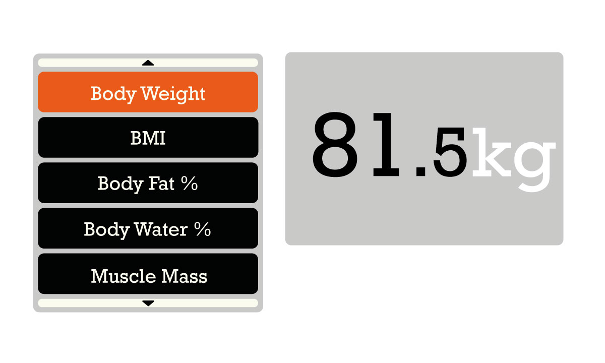
The results screen of the redesign
Using the conclusions from the first user test, three concepts for possible redesigns were developed. These concepts all had a different level of technology and viability. One concepts was very conservative, one was very futuristic and the other was somewhere in between. For the final design it was decided to combine elements of the conservative and moderate concepts. This concept was worked out further. A physical model of the scale itself was made from cardboard and foam. For the interface, a clickable prototype was made on a computer. During the detailing phase, I mostly worked on the flow of the screens. I also helped on detailing the graphics of the interface.
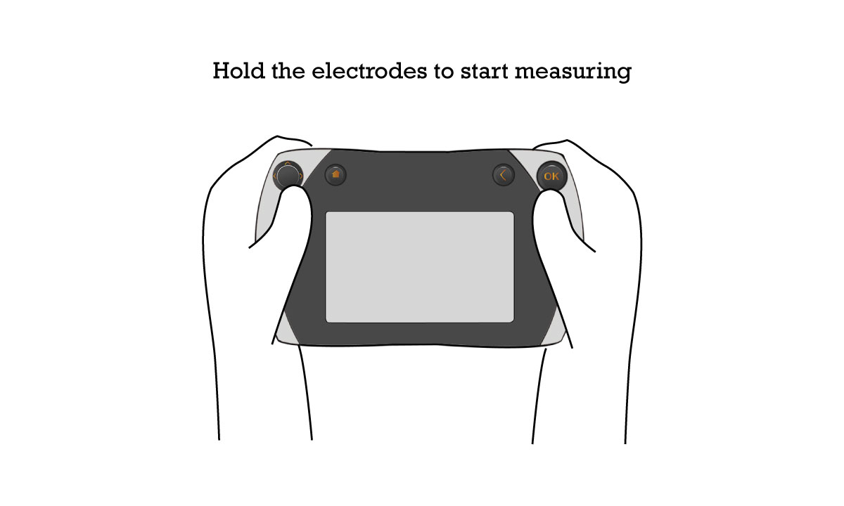
The screen that guides the user during measuring of body composition
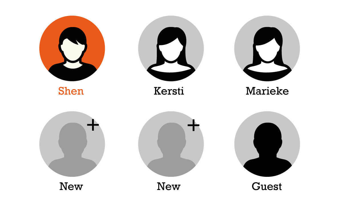
Selecting a user profile
Selecting an action