THE PROJECT

This project was done for the course "Joint Master Project", where students of the different masters work together on one project. The assignments are given by a real company. Our assignment was done for Teva Pharma, a large pharmaceutical company.
The goal of this project was to increase therapy loyalty in asthma patients. We chose to focus only on teenagers and young adults with asthma, as the problem of therapy disloyalty is the largest in this age group.
Project done by: Sally Augustijn, Eduard de Jong, Marieke Lous and Jette Mul
THE PRODUCT
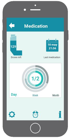
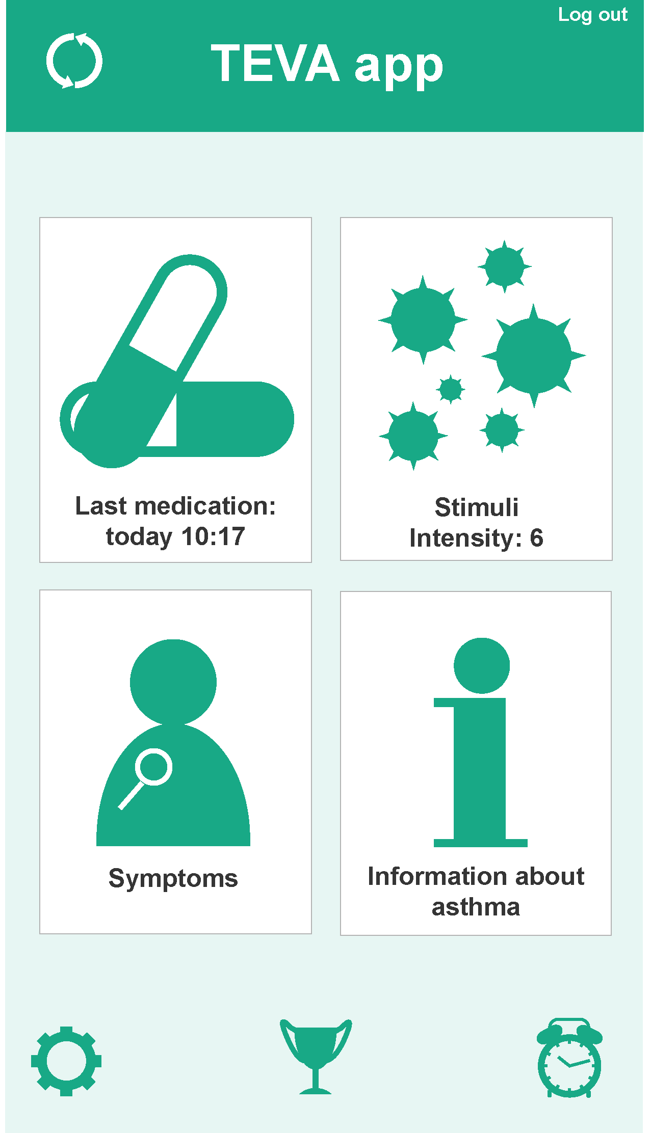
To achieve the goal of enhancing therapy loyalty, visual feedback is very important. The final design of this project consisted of two parts that both provided visual feedback; one part was the Rapp, an app that provides the users with visual feedback on their inhalation habbits. The app also provides the user with the opportunity to keep track of the stimuli they encounter and the symptoms they experience.
To achieve the goal of enhancing therapy loyalty, visual feedback is very important. The final design of this project consisted of two parts that both provided visual feedback; one part was the Rapp, an app that provides the users with visual feedback on their inhalation habbits. The app also provides the user with the opportunity to keep track of the stimuli they encounter and the symptoms they experience.
To achieve the goal of enhancing therapy loyalty, visual feedback is very important. The final design of this project consisted of two parts that both provided visual feedback; one part was the Rapp, an app that provides the users with visual feedback on their inhalation habbits. The app also provides the user with the opportunity to keep track of the stimuli they encounter and the symptoms they experience.
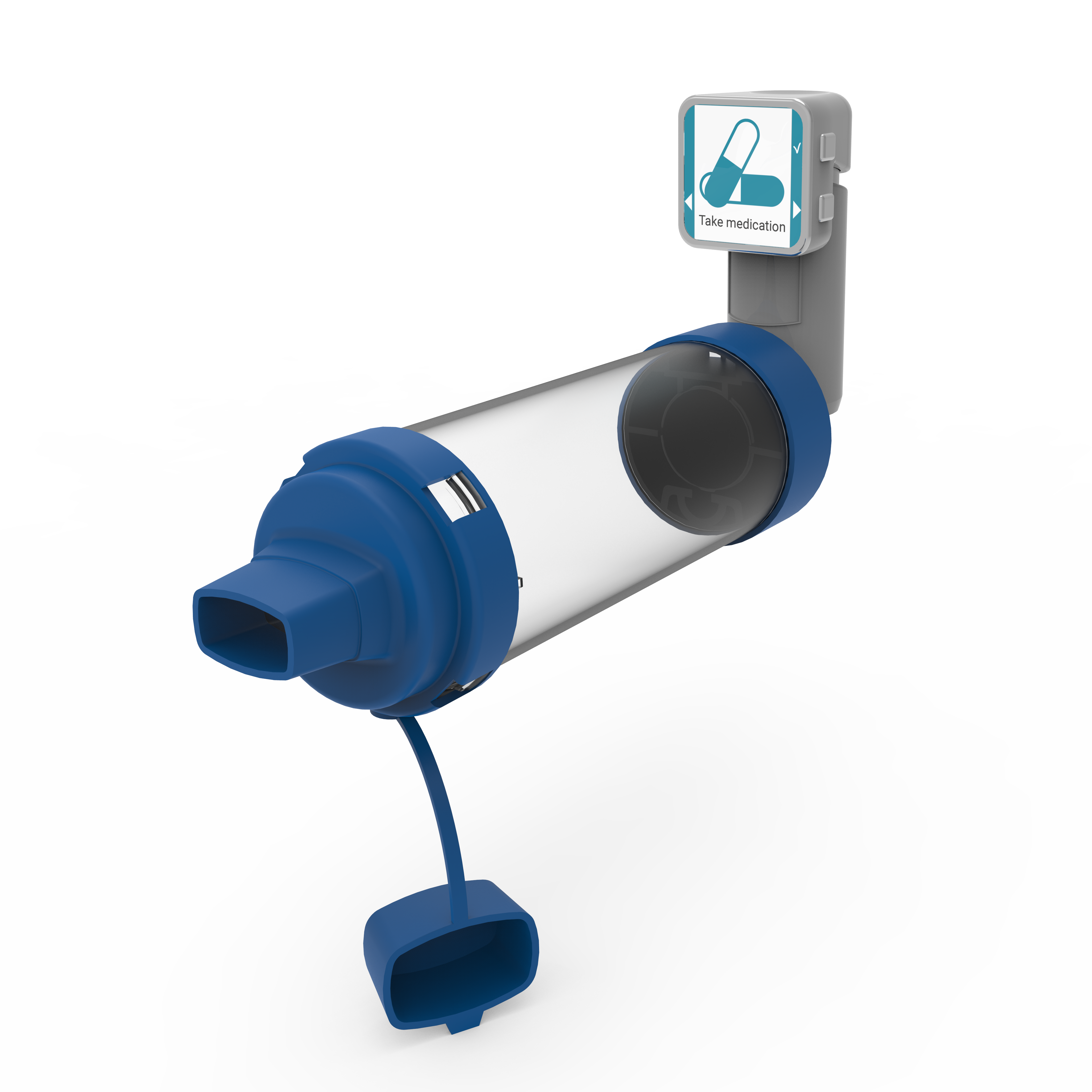
The other part of the design was the Respberry, a small device that can be put on top of their inhaler to guide them during inhalation. It is important that the angle of the inhaler is correct, so the medication reaches deep into the lungs. The Respberry can also be used to take note of stimuli or symptoms in case the user cannot use their phone.
Clickable mockups of the interfaces can be found here for the app and here for the device.
THE PROCESS
This project was divided in three phases:
During the first phase, the whole group did an analysis of the current situation. This was done by literature study, reviewing existing products, interviewing an pulmonologist, and interviewing asthma patients.
This information was clustered and structured to be able to get an overview of how people currently deal with their asthma.
Since one conclusion was that there are many differences between different demographic groups, we decided to only focus on teenagers and young adults.
Clustering information
Start screen mock-up
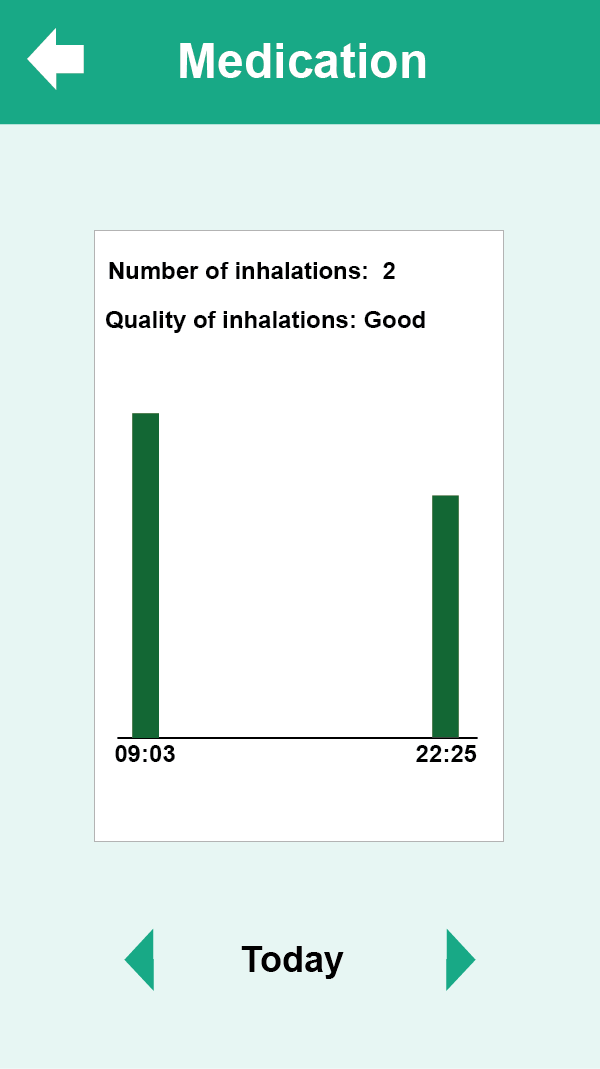
Medication screen mock-up
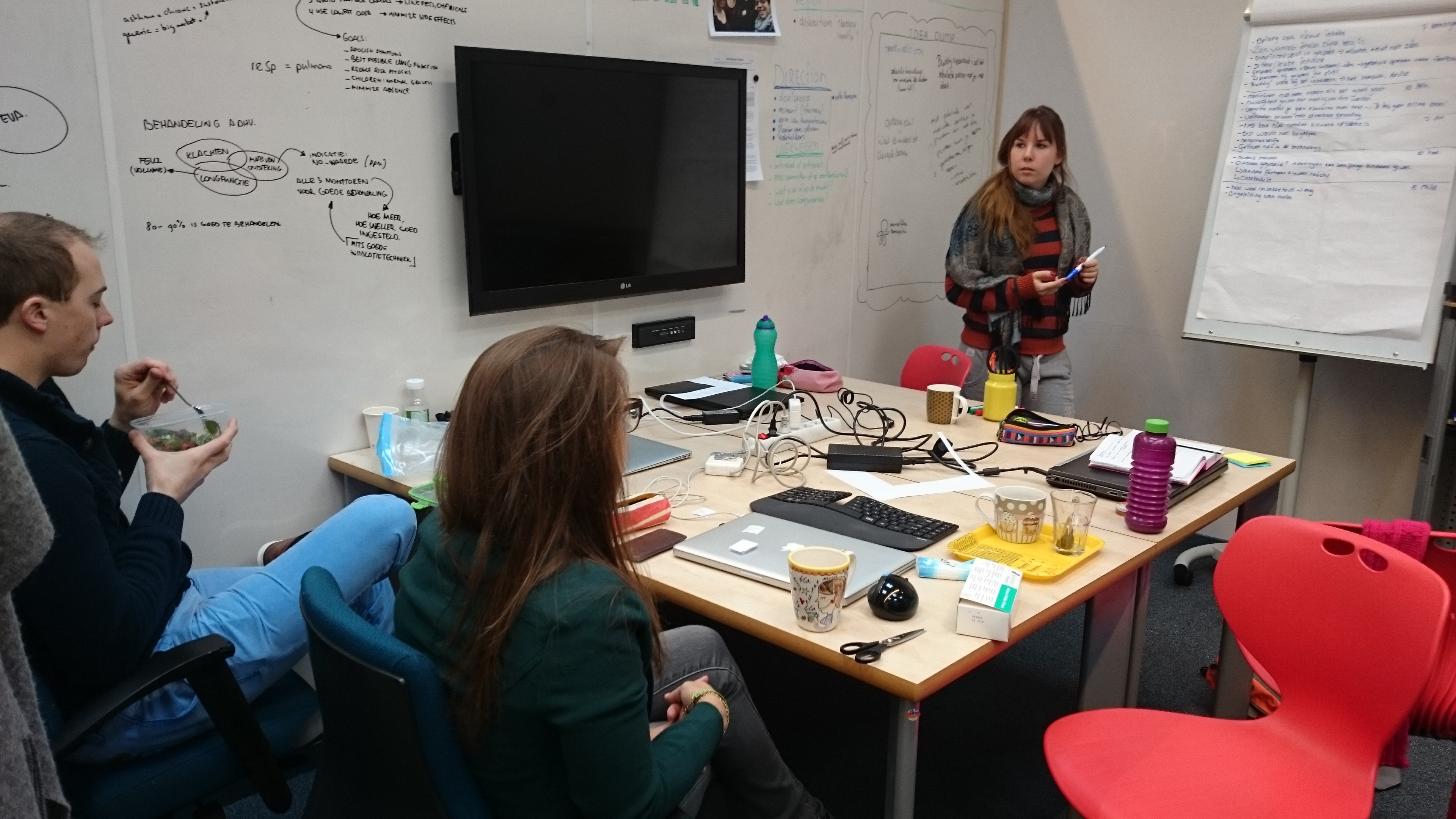
The second phase was ideation. We started out by brainstorming for ideas or subideas, based on the information we found in the previous phase.
A codesign session with teenage and young adult asthma patients was conducted to get insights from our target group.
All the ideas were used to develop three concepts. As a student from Design for Interaction, I made sure that the concepts would be user friendly and easy to use.
The first concept was an app that helps the patient keep track of their inhalation habits. The second concept was a device to put on your inhalor that provides basic information on inhalation technique. The third concept was a stand-alone device that can measure NO-value in the patient's breath. The divice had an interface where the user can find information on stimuli such as pollen.
The first and third concept worked with interfaces. I made simple wireframes and mock-ups of these interfaces to communicate to the company what these would look like and how they would work.
The final phase was embodiment. During this phase I mainly focussed on working out the interfaces of the final concept; an app to keep track of medication habits in combination with a device to guide inhalation. Both had an interface, and my task was to design the UI for both. I made wireframes and clickable mock-ups, which were used during a user test to see if the users encountered any problems with the product. The clickable mock-up for the app was downloaded onto a phone to provide a more realistic experience. The interface of the device was tested on a laptop. The results from this user test were used to make the final alterations on the design. The clickable mockups can be found here for the app and here for the device.
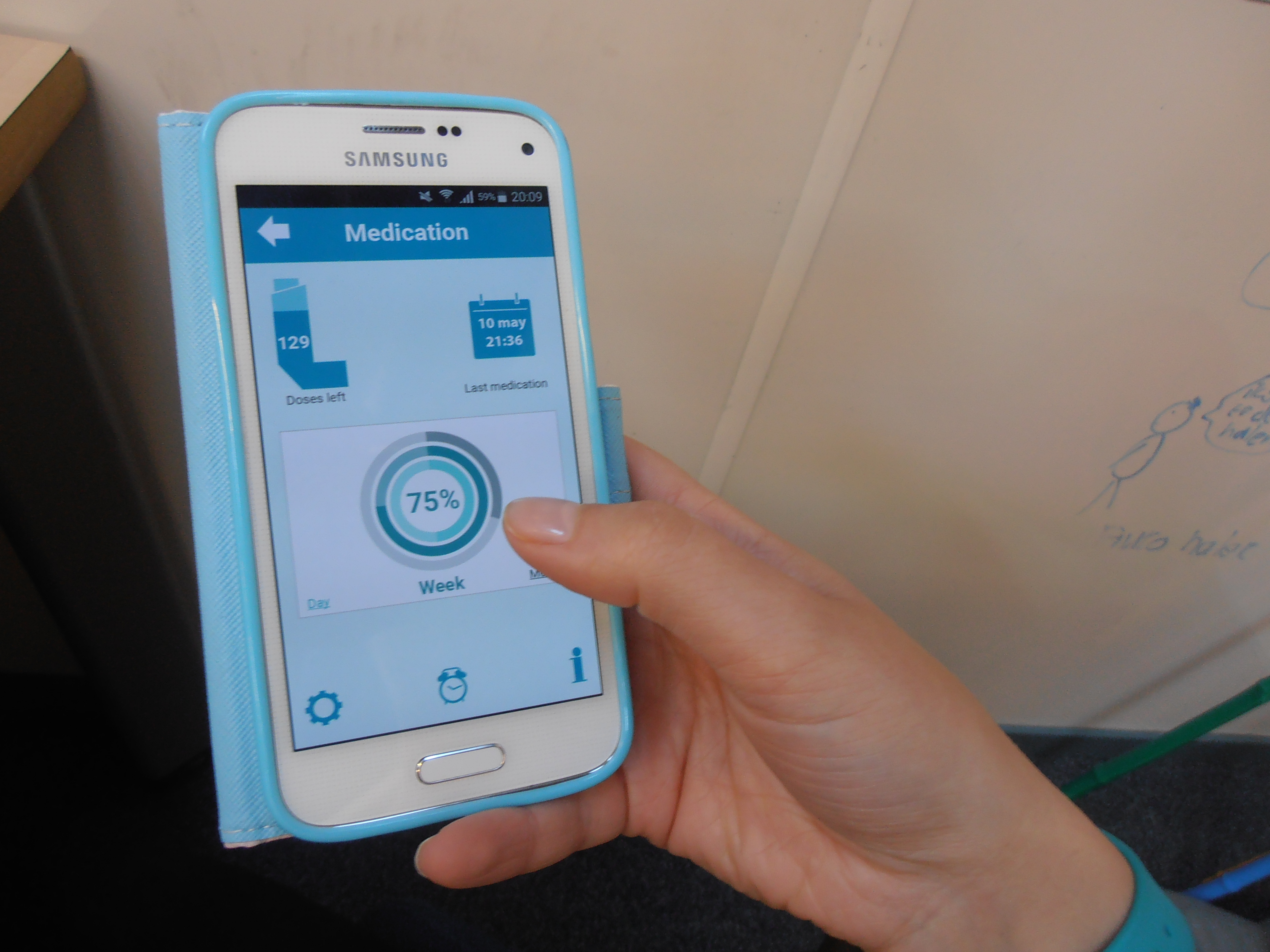
The app, ready for user testing